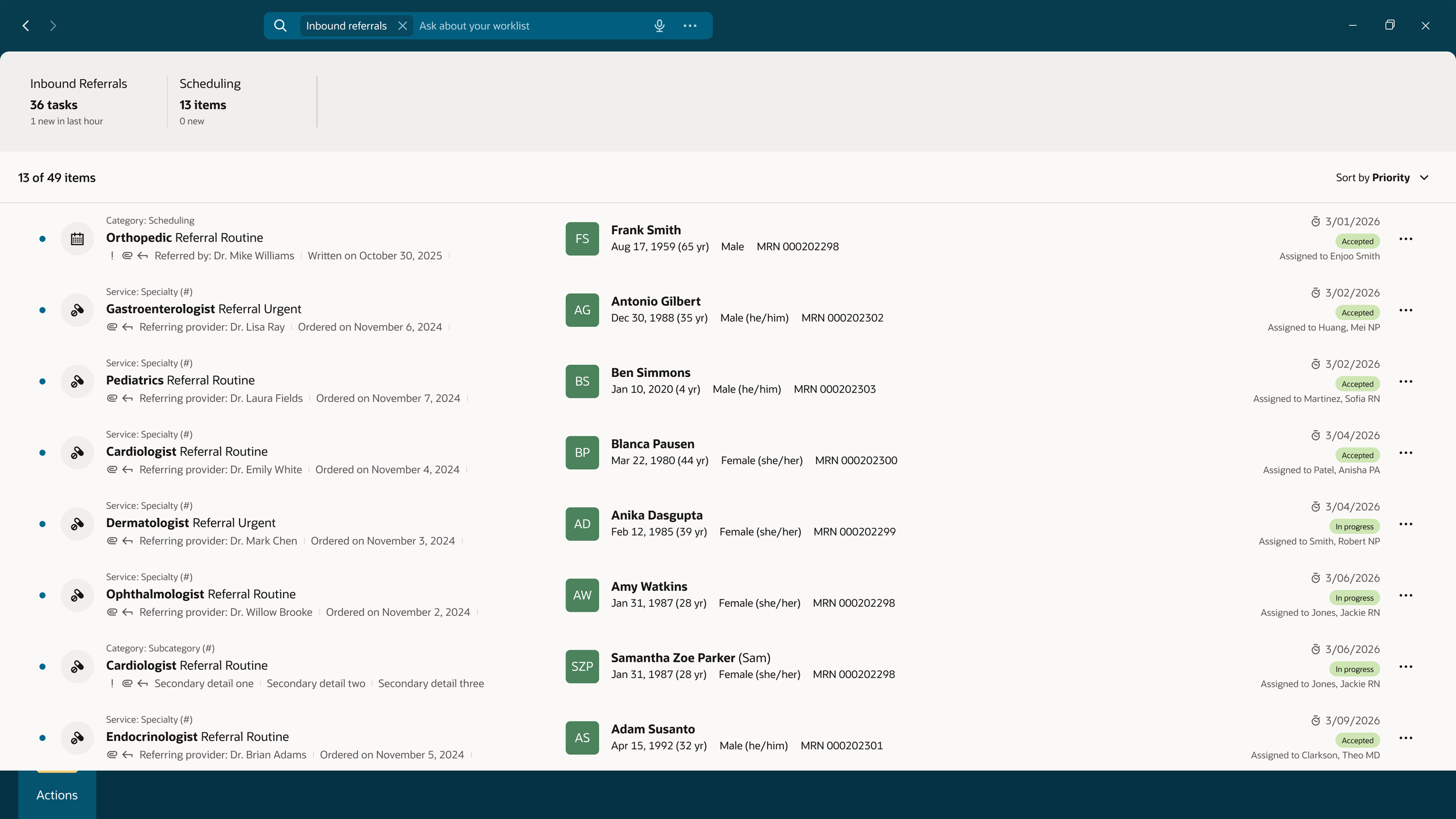
Referral Workflow
For the Referral designs and workflow, I’ve had the opportunity to lead the team with the supervision of a Principal UX designer. I’ve collaborated with the UX team, Product, UX Research, and Developers to design and launch a Referral Coordinator’s review process. This workflow includes: reviewing a referral, editing or adding information to the referral, sending of the referral, acceptance/rejection of a referral, and how that referral then goes through the scheduling process.
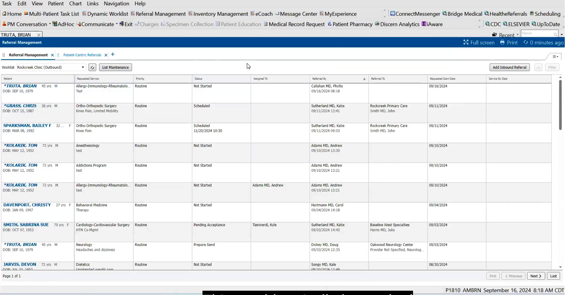
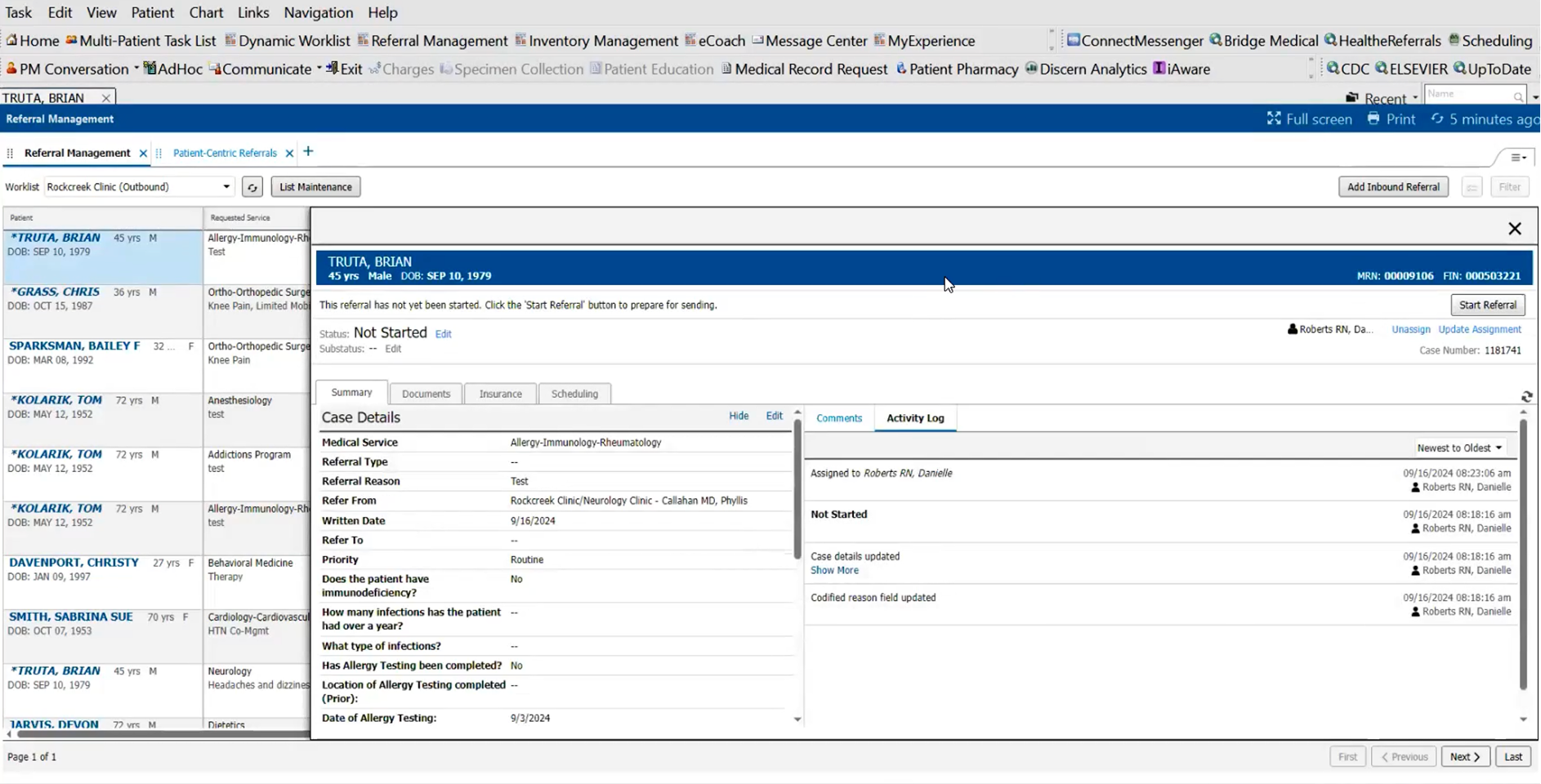
Current Healthcare Product
The Ask
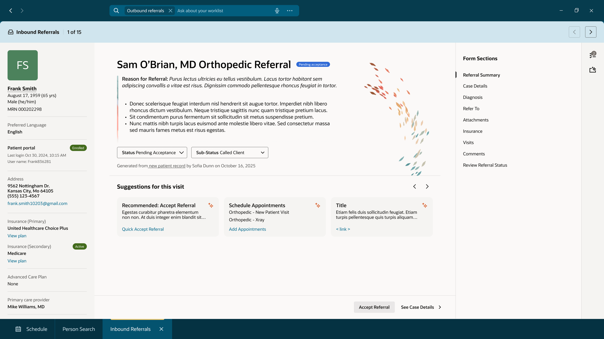
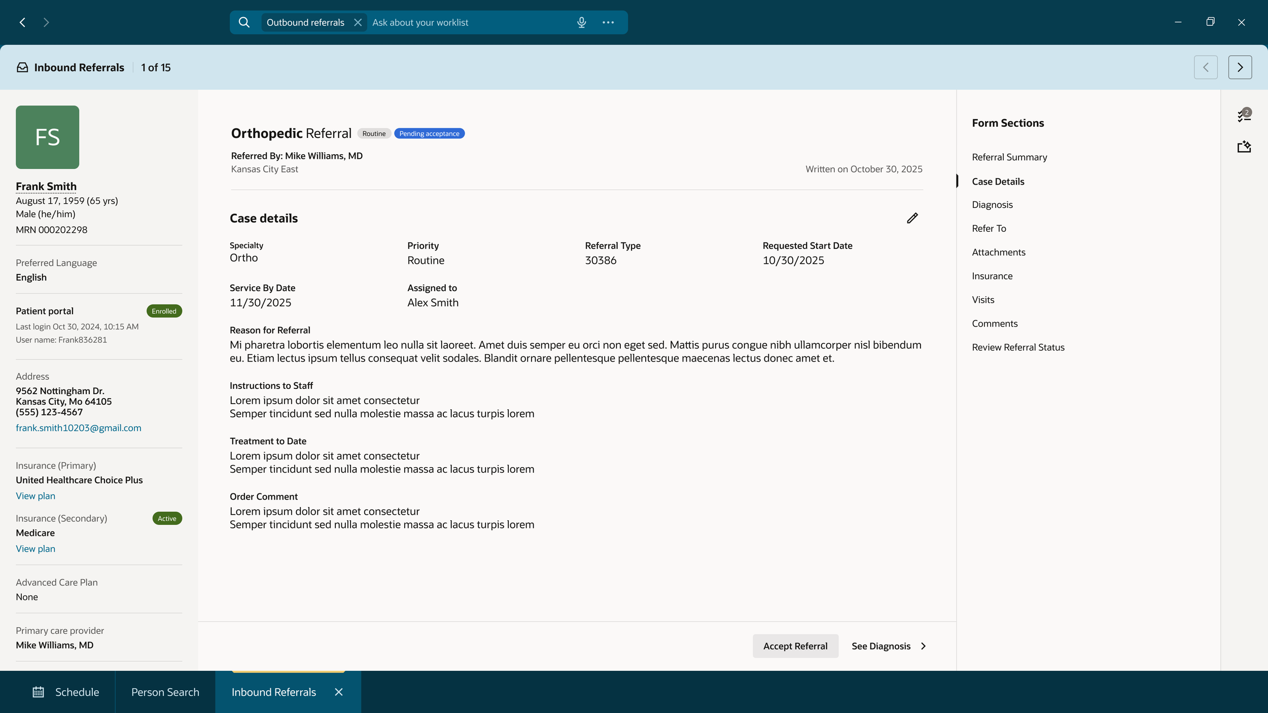
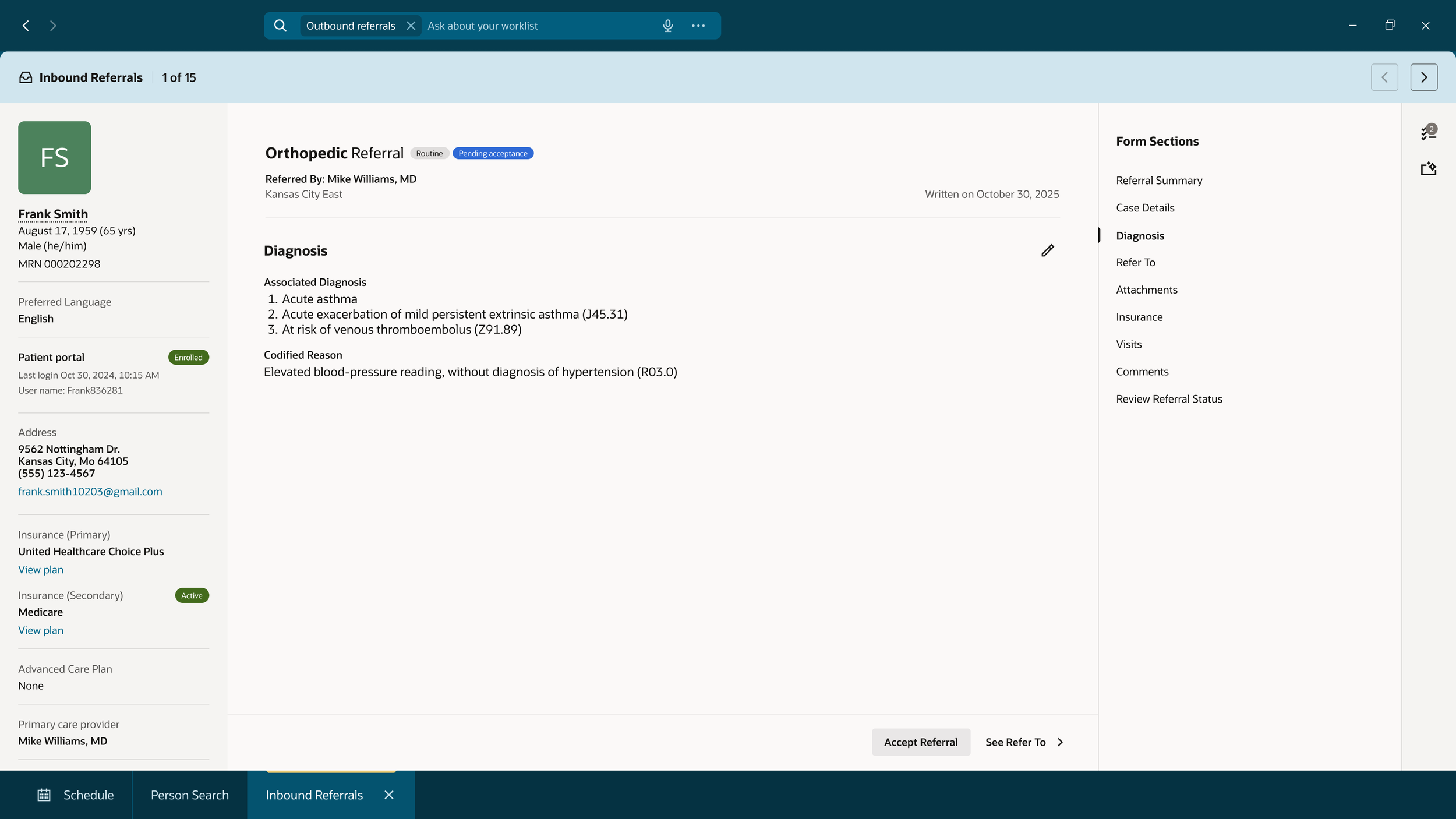
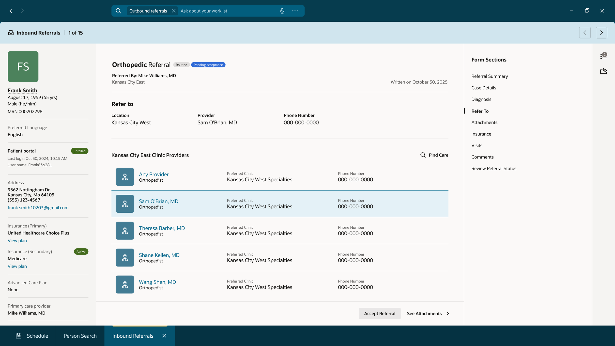
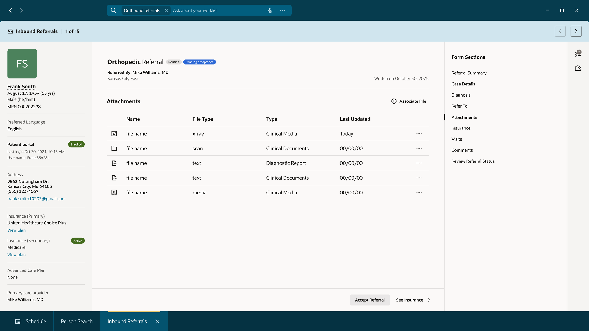
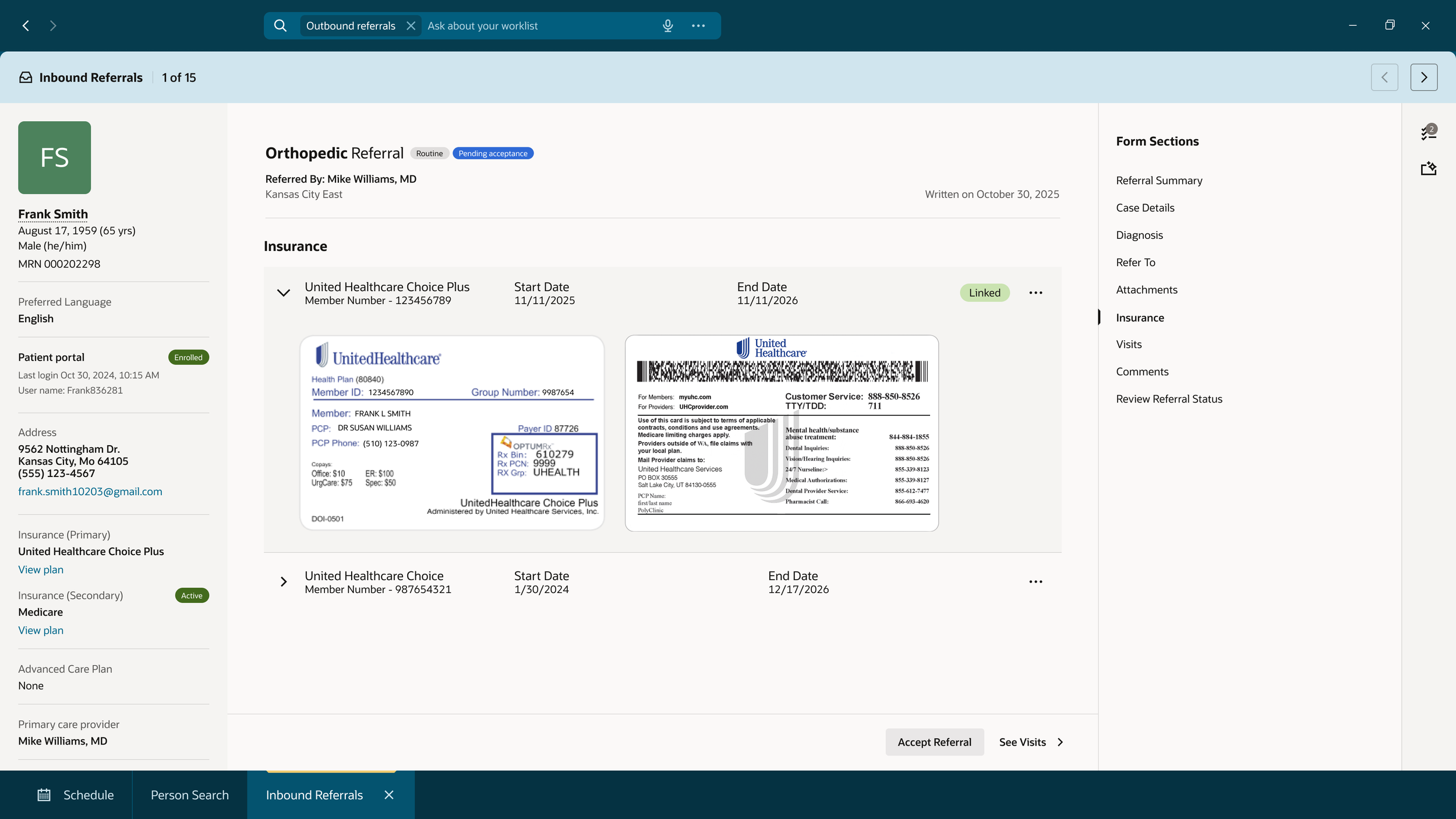
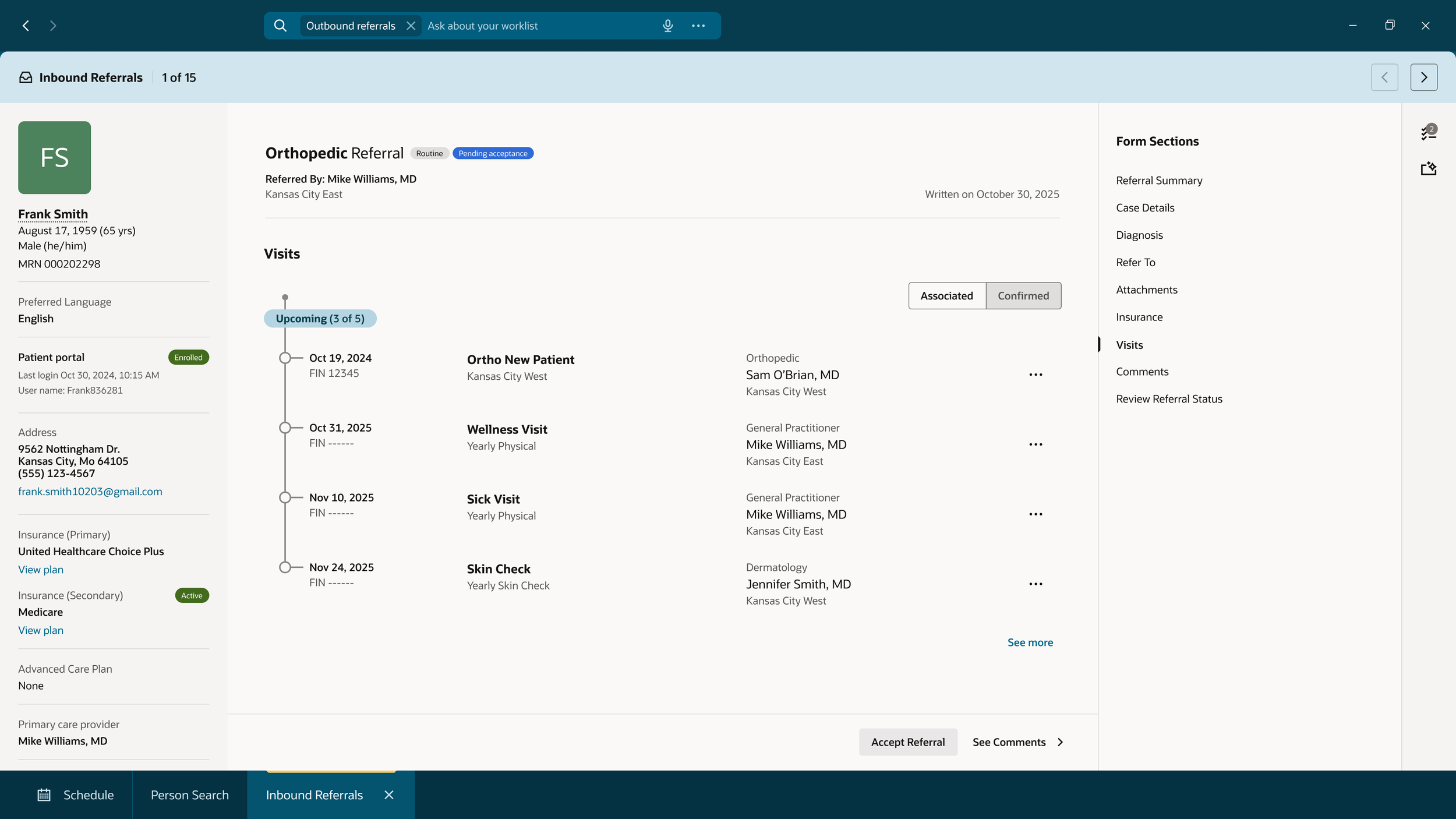
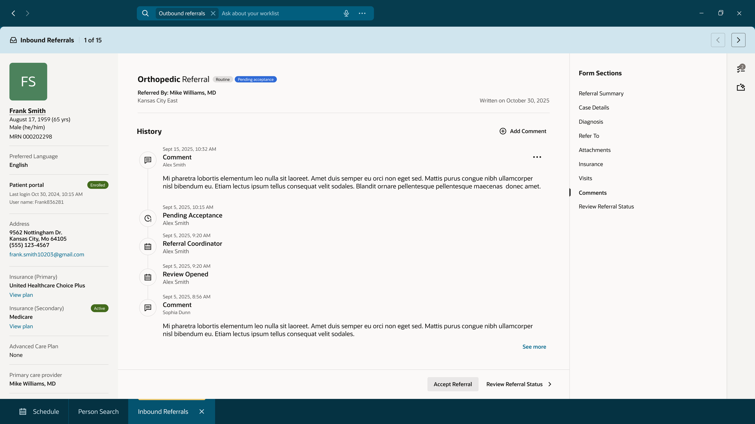
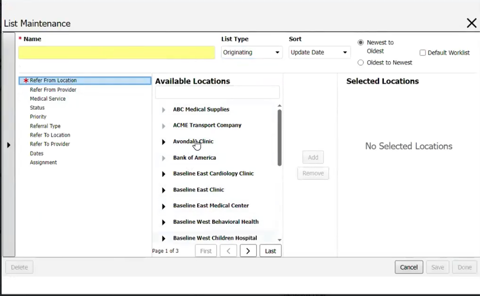
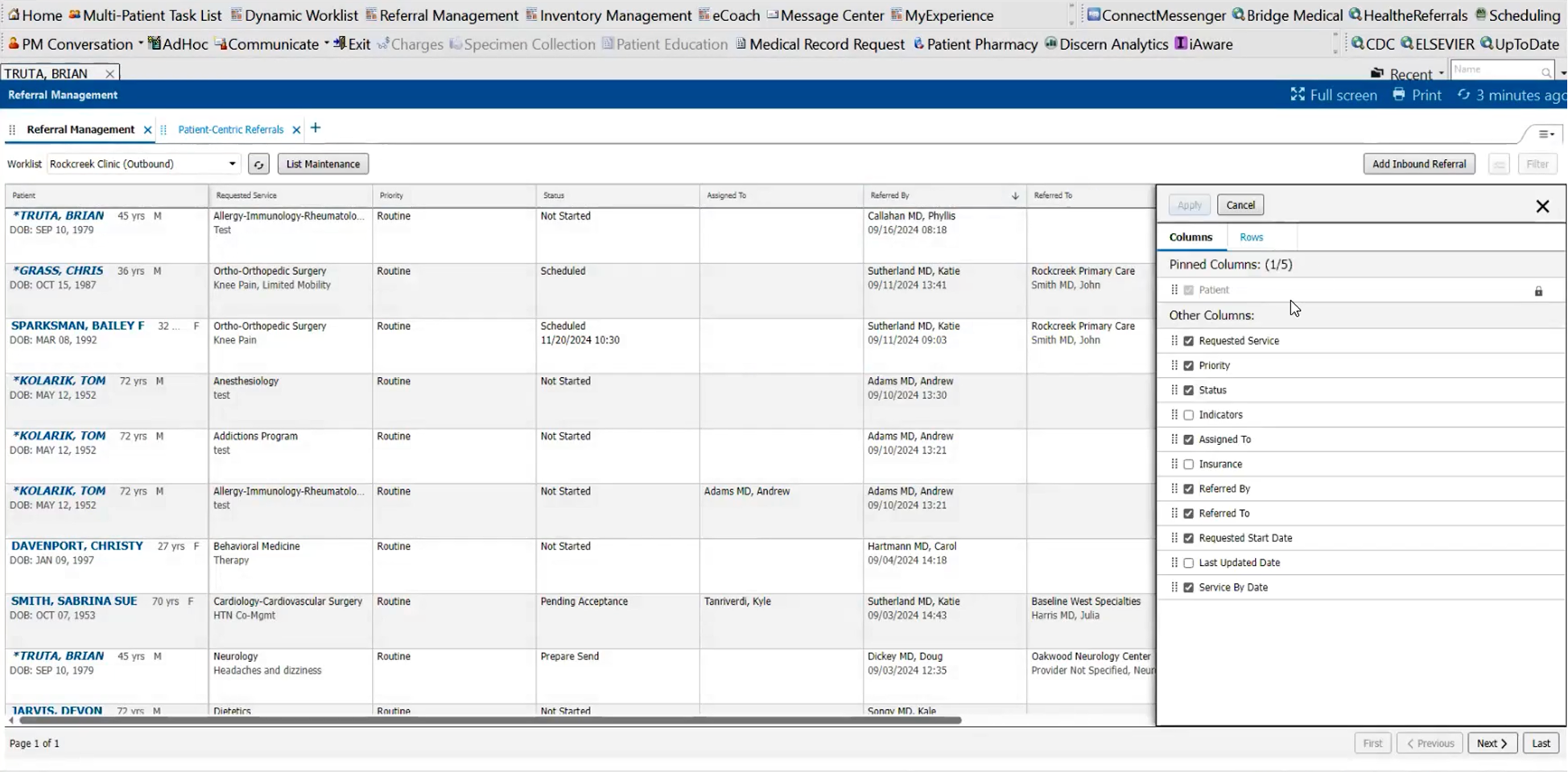
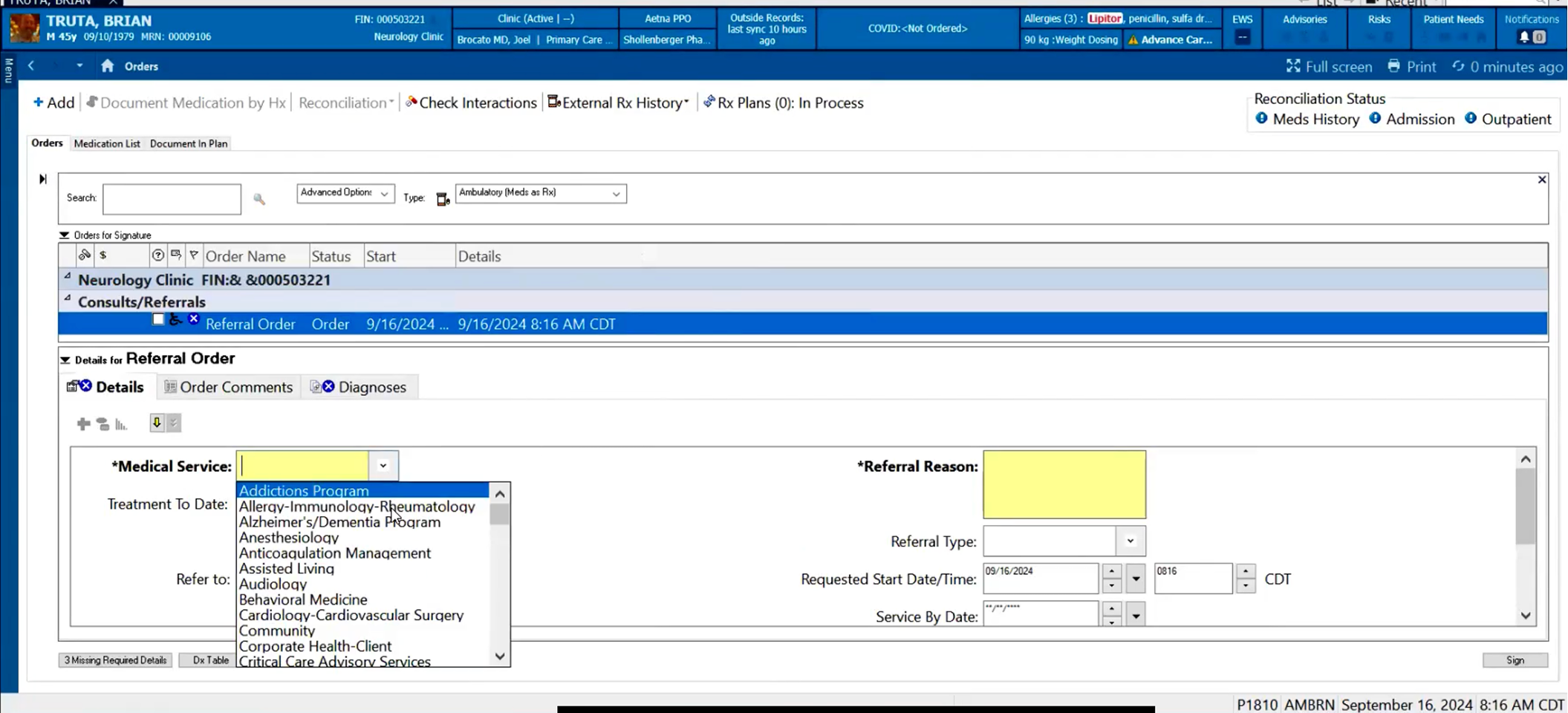
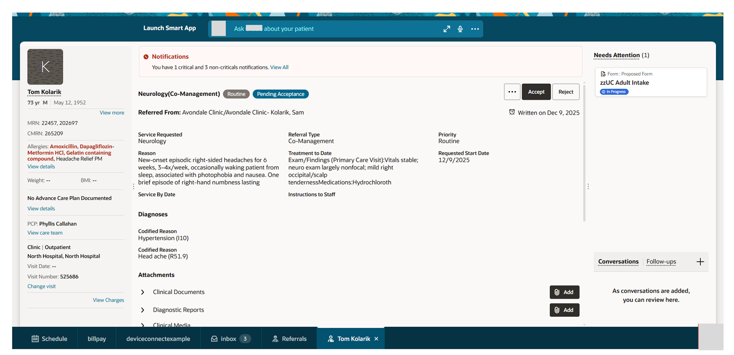
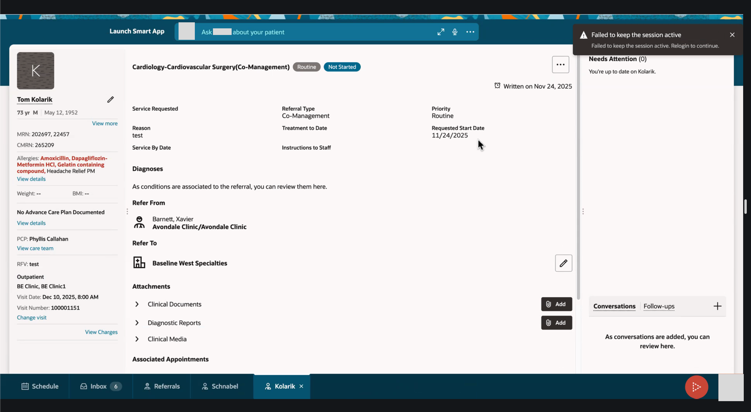
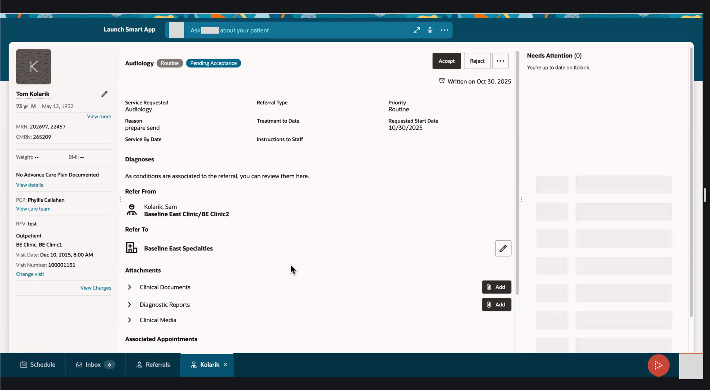
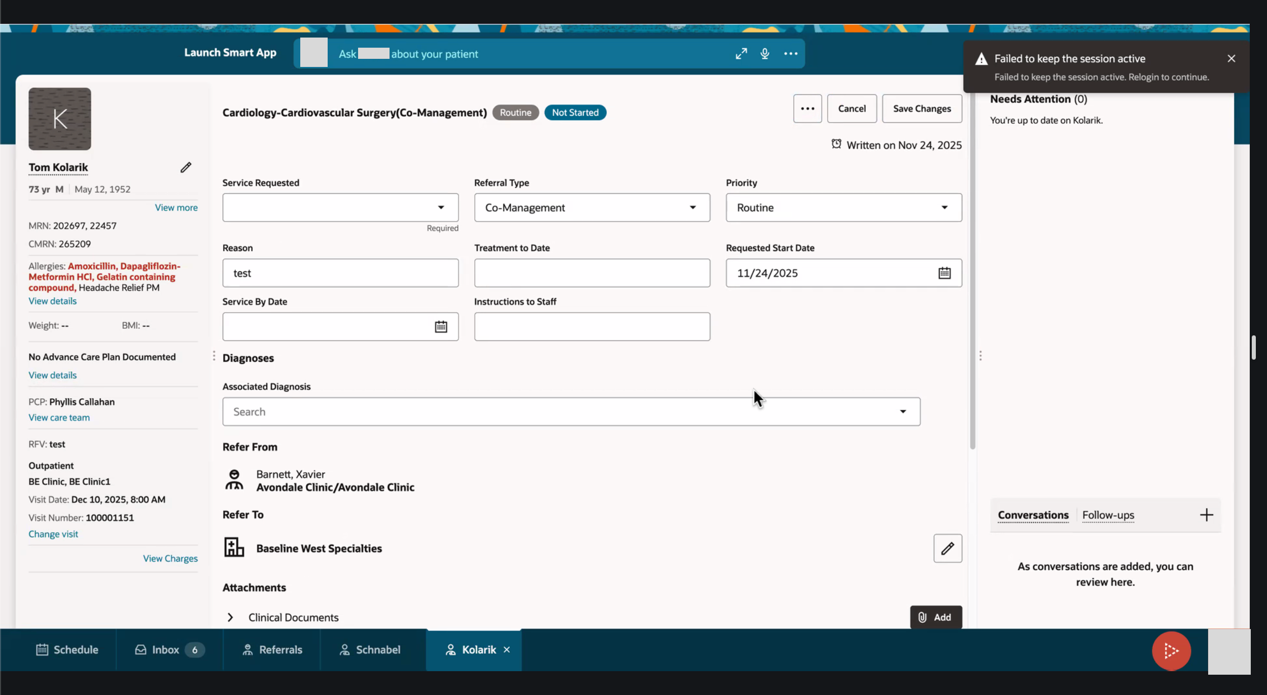
Product and Development came to our team with concept designs for reviewing a Referral and needed UXs input and suggestions on how to improve the design. I needed to rebuild the screens using UX approved templates and designs, while discussing with Product what would be best to have visible up front for our users vs what could be secondary information accessed elsewhere.
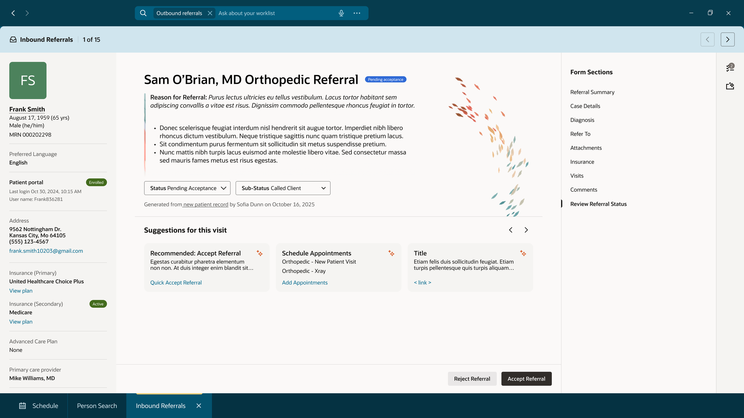
A last minute request came in to update the design to be more agentic and AI forward. If the user needs to view all of the information in the referral, it’s all there. In the case where the Referral is more straight forward, AI steps in.
The UX stance
Our biggest focus was to simplify the system and bring as much information to the user so that they don’t have to go find the information themselves. While working on this redesign, we had a few assumptions that we made with our Product team that we built this design off of.
Our system is connected
- All products that our users need to do their job are integrated into one.Our users wear multiple hats
- A PAS user could be the front desk greeter, scheduler, call center, clinic administrator, and so many more jobs, in one. Our system needs to be able to flex with what they are doing and who they are talking with, on the fly.They system does the hard work for our users
- Instead of our users needing to fact find, and put the puzzle pieces together themselves, we want the system to do that for them.Push the work onto the patient to do in the Patient Portal
- To lessen the workload on our users, we pushed for a better Patient Portal experience (a separate team worked on this). With a well built and user friendly Patient Portal, it brings self-service to the forefront, it pushes the more simple tasks onto the patient to complete on their own time.
User flows and Dev + Product Designs
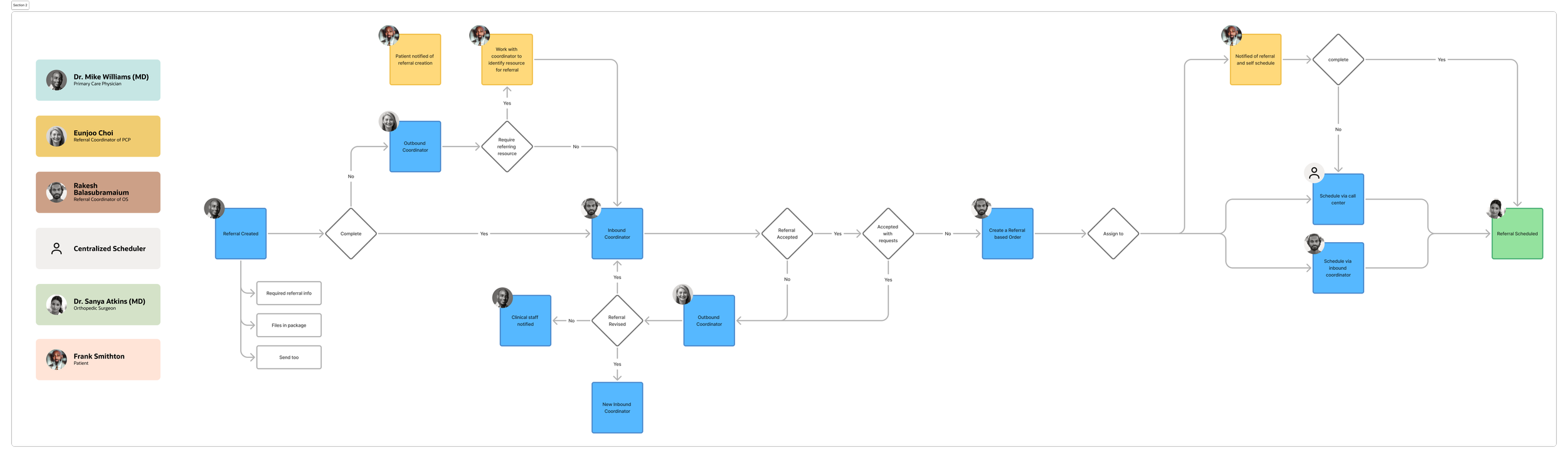
Referral workflow
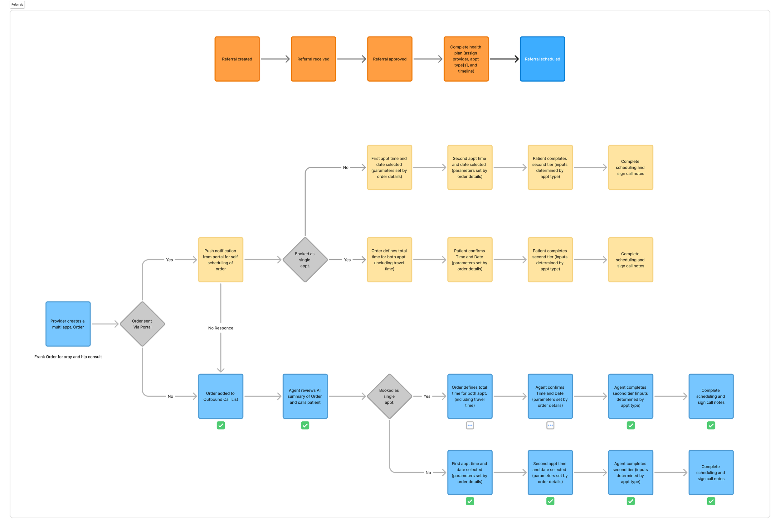
Referral workflow / Scheduling workflow
Dev + Product design
Dev + Product design
Dev + Product design
Dev + Product design
The Outcome
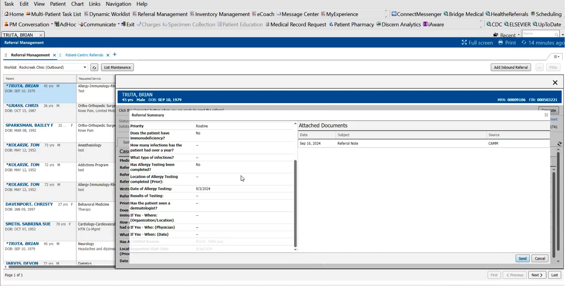
By leveraging AI, the system brings forward the necessary information for the Referral Coordinator to review and then gives a recommendation on if the user should accept or reject the referral.
AI summarizes the referral and recommends that the user should accept based on if everything is correctly and fully filled out, so then the user can bypass reviewing everything individually and accept the referral upfront. This results in Referrals being accepted (or rejected) much faster and puts less strain on the user to fact find and put the puzzle pieces together themselves.